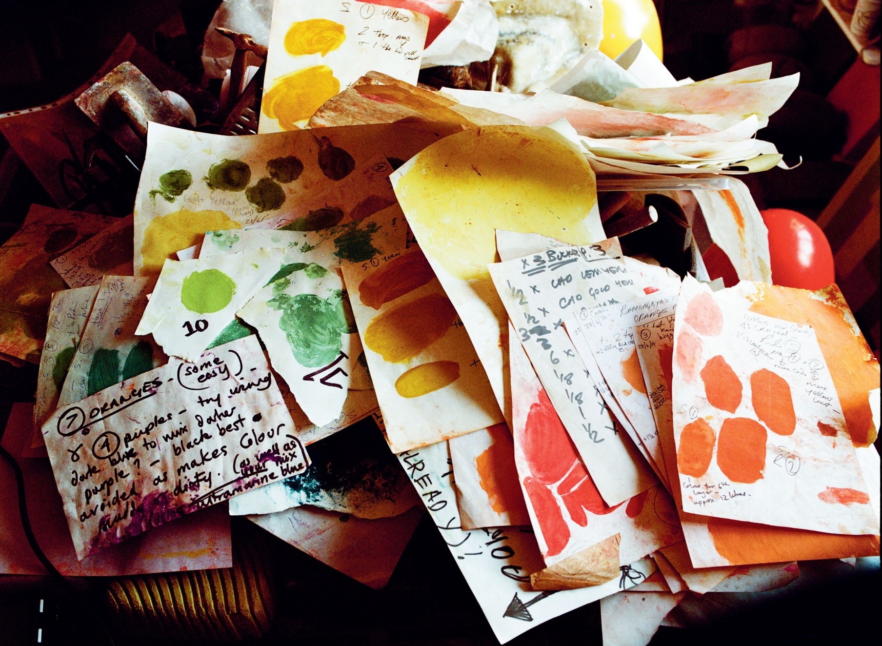
The Daily Grind
WORDS KASSIA ST CLAIR
PHOTOGRAPHS POLLY WREFORD
CREATIVE DIRECTION KATIE PHILLIPS
Inspired largely by the fresco technique of Rajasthan, artist Muirne Kate Dineen’s principle passion is ‘building colour’ – grinding the raw ingredients to mix the pigments in her London studio
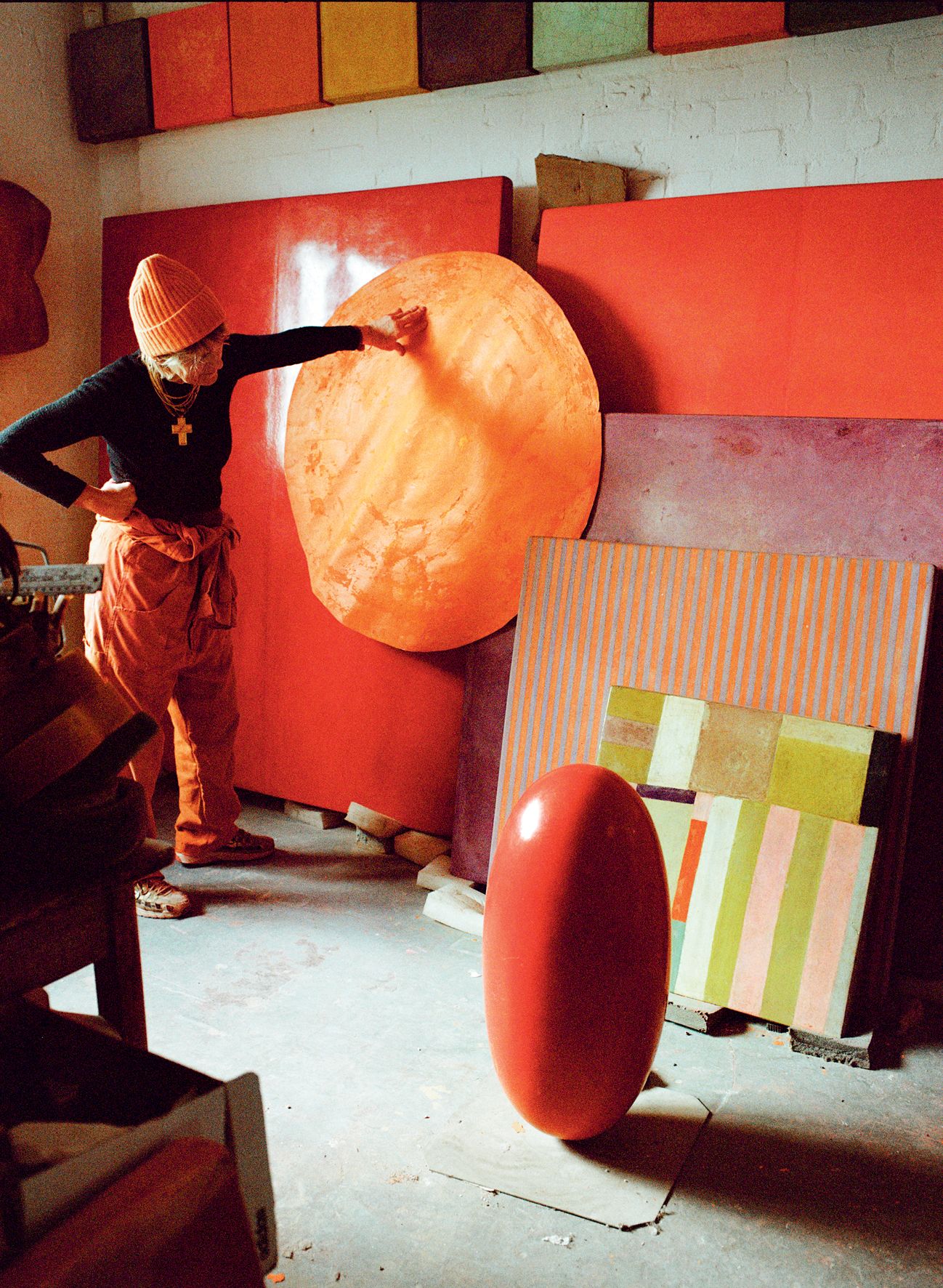
Quinacridone rose. Phthalo blue. Cobalt turquoise. Alizarin crimson. Chrome yellow. Terre verte. Mars red. I’m reading the labels on a rainbow of baggies, bottles and jars crammed onto the shelves and cubby holes that line one end of an airy London studio. I crane my neck, but they stretch up out of reach and reading height: two sky-blue ladders lean against the double-height walls nearby. Sculptures in various stages of preparedness are stacked in corners, swaddled with strips of muslin or chunks of foamy padding. Along the work bench are petal-shaped pestles, each bearing traces of the last pigments ground in them: several fiery pinks and a chartreuse so pale it evokes the first light of a spring dawn. Surfaces are littered with sheets of paper covered with swatches and palettes for new commissions. This is Dr Muirne Kate Dineen’s workspace: a shrine dedicated to pigments old and new.
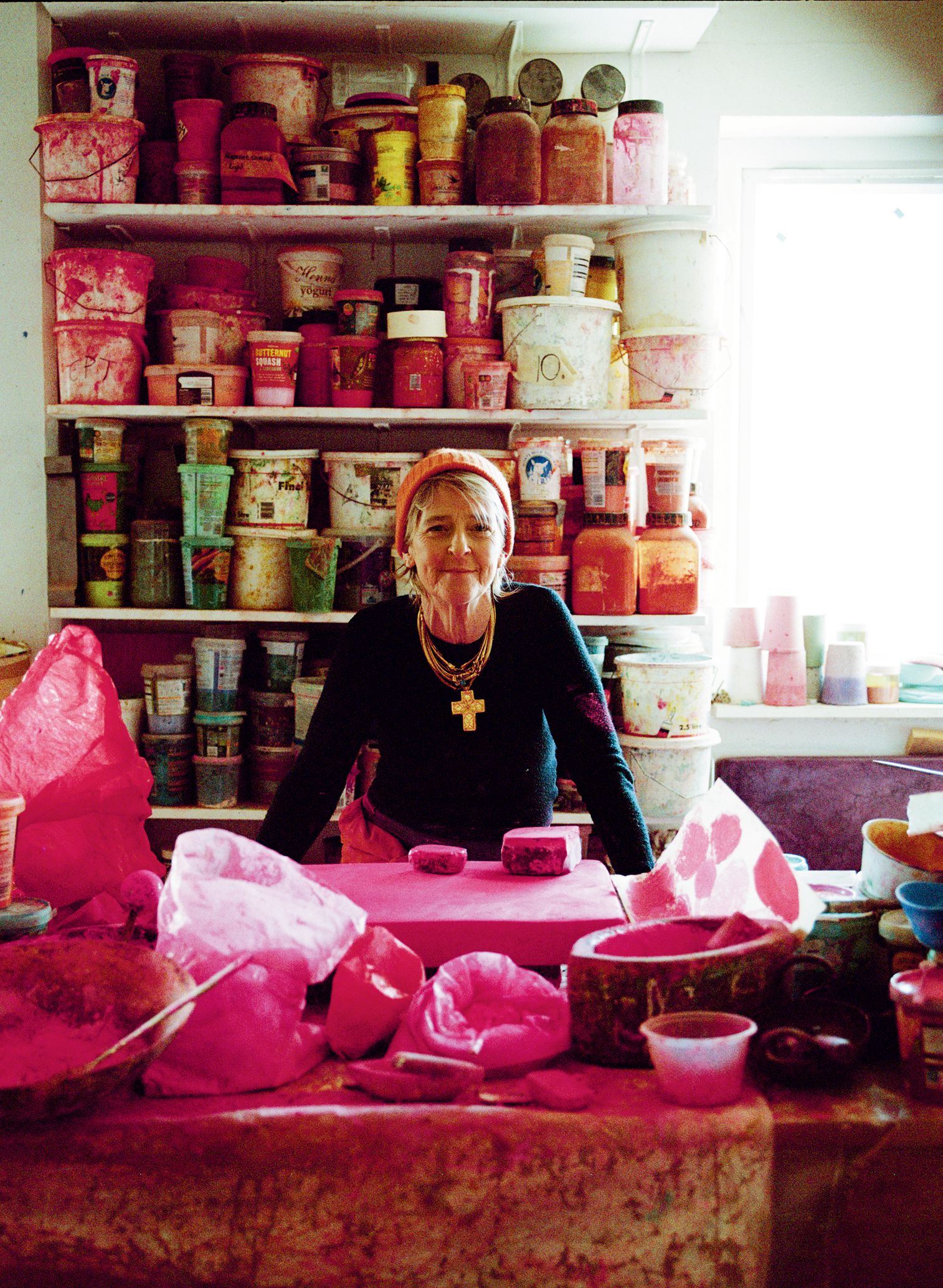
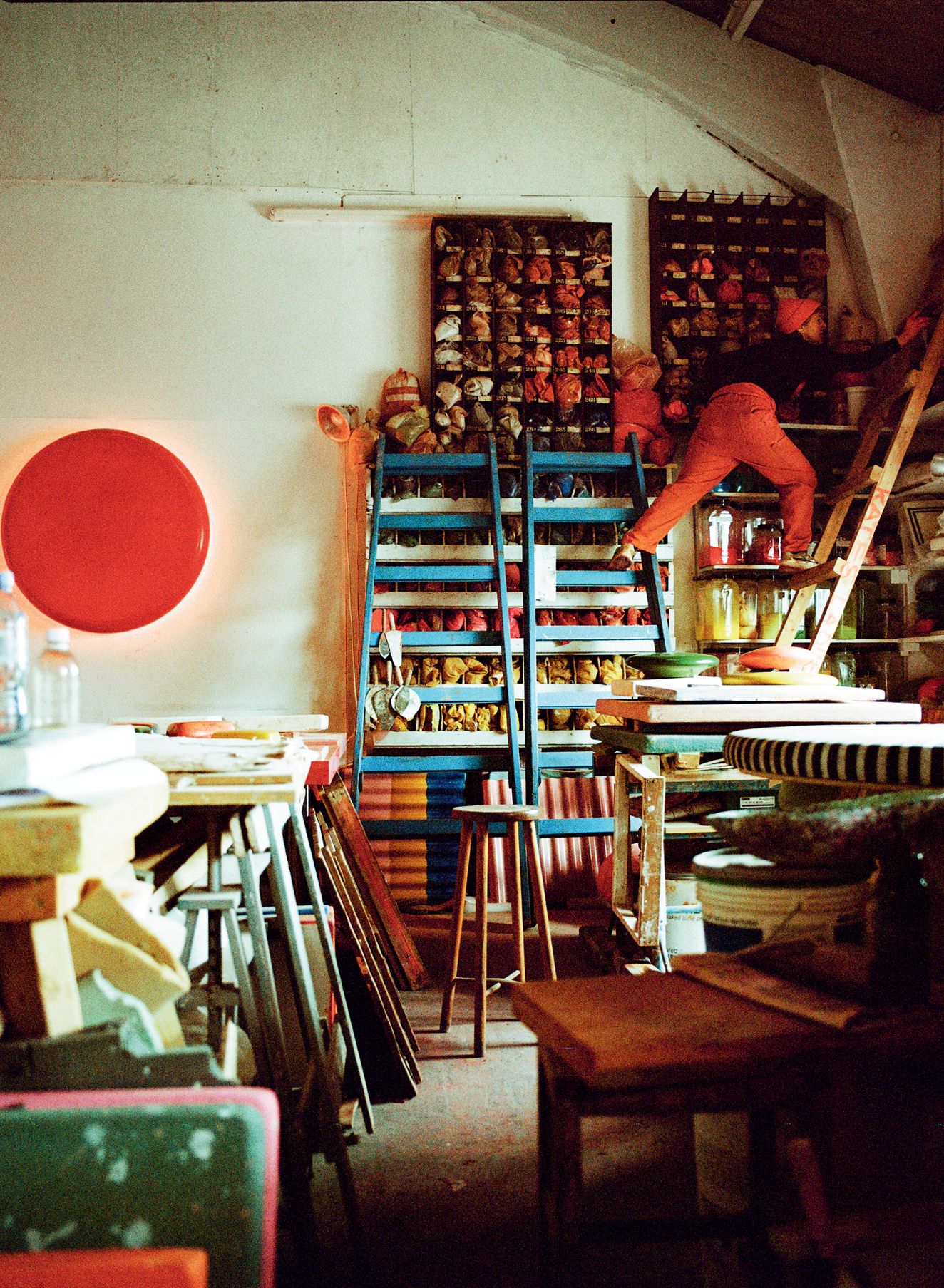
Colour artist Muirne Kate Dineen in her studio – an alchemist’s cave of pigments, palettes, swatches, colour-stained pestles and sculptures-in-progress
Dineen is a puckish presence. She wears a mess of gold necklaces layered over a paint-spattered top and loose trousers. She would prefer not to give her age – ‘That way people can’t pin me down. They can’t put me in a box,’ she explains. ‘Maybe you can say I’m over 50?’– but she has a wiry, restless physique. As we talk, she is a blur of motion, gesticulating with her hands, jumping up to find a piece we’re discussing, fetch her iPad, or pass me objects that she uses in her practice. A pebble picked upon a beach; scraps of muslin bright with strained dye; a pair of wooden blocks.
Her preferred practice – sculptures built up with a mural technique traditionally used to finish buildings in Rajasthan – has evolved over two-and-a-half decades. Before that she was something of a magpie. She got her degree at the London College of Printing and Graphic Design, where she learnt about printmaking, etching, bookbinding and lithography. Later came a Master’s in Fine Textiles at the Royal College of Art. ‘What I love – really love – are things that are tactile.’
‘Tactile’ is certainly one way to describe Dineen’s practice. Some of her work is commercial and architectural: floors or wall treatments in collaboration with brands or architects. But the bulk of what she does in her studio are fine-art sculptures. These come in a variety of forms, from rectangular blocks nearly two metres high, to egg-like lingams the size of a new-born baby but four times as heavy (men and women instinctively cradle them, she says.)
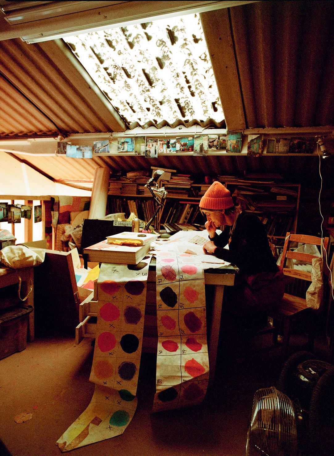
Left: Dineen is greatly influenced by a technique of fresco painting that originated in Rajasthan. Displayed in her studio are photographs she took in Mumbai and Jaipur showing street housing that people have built or assembled and decorated with any paint they can find. Right: checking the colour of a rough drawing for a commission, to make sure the ‘Orange is contrasting and not too close to a Red Orange’
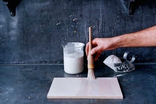
All begin as powder. She combines several grades of ground marble – from something as fine as flour to one more akin to granulated sugar – and mixes them with slaked lime using a heavy, hand-operated stone mill. It is physical work. The slaked lime, which she invites me to dig my fingers into, is soft and white and a littles limy, like very loose China clay or the silt at the edge of a river. It is also corrosive. ‘My hands are often a real mess,’ she sighs, examining chapped nail beds. (I can sympathise: as I write this, the skin between my fingers, unused to the lime, is red and sore.) She’s left with something the texture and consistency of wet cement, to which she adds pigments that she grinds in her pestles.
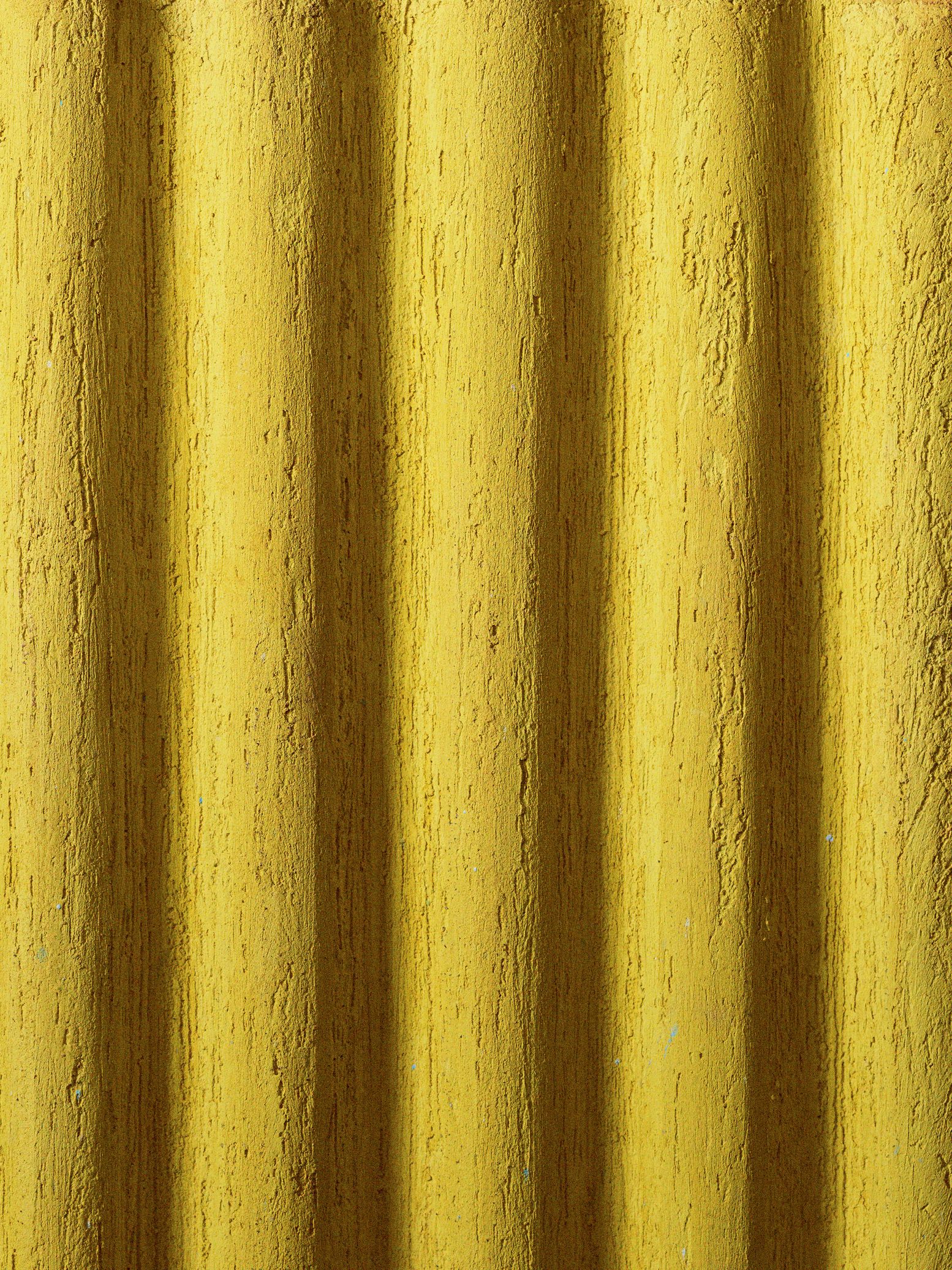
Her pieces are then built up, layer upon layer, in moulds. Each layer must be ground with wooden blocks to compact it and ‘bring up the marble grain’ and then left to dry. This process is repeated up to 18 times. The result is a dense, impenetrable and highly pigmented surface that offers almost infinite possibilities. She gouges designs into some: undulating lines or spirals, that can be filled with contrasting hues. Some she leaves rough. Many are smoothed, glossy and reflective, an effect achieved by polishing the surface with agate.
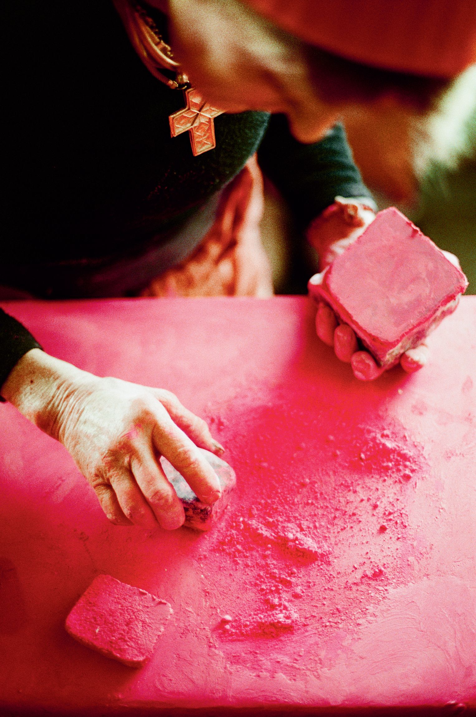
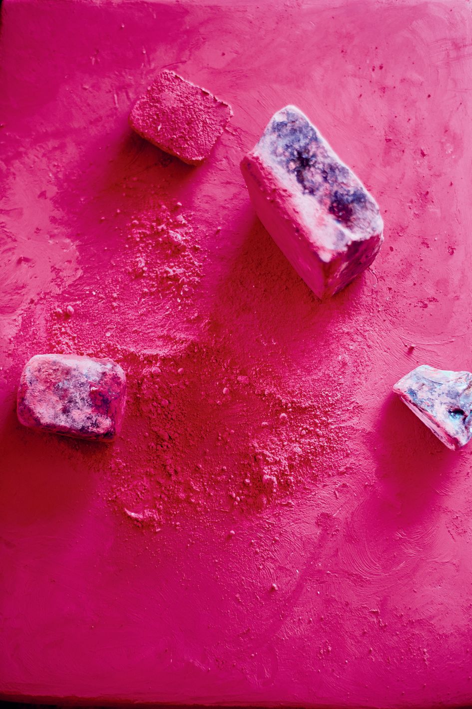
Grinding and mixing the colours herself means Dineen can never completely control the end result, something she delights in: ‘It’s exciting. You have the potential to make something truly beautiful and unexpected’
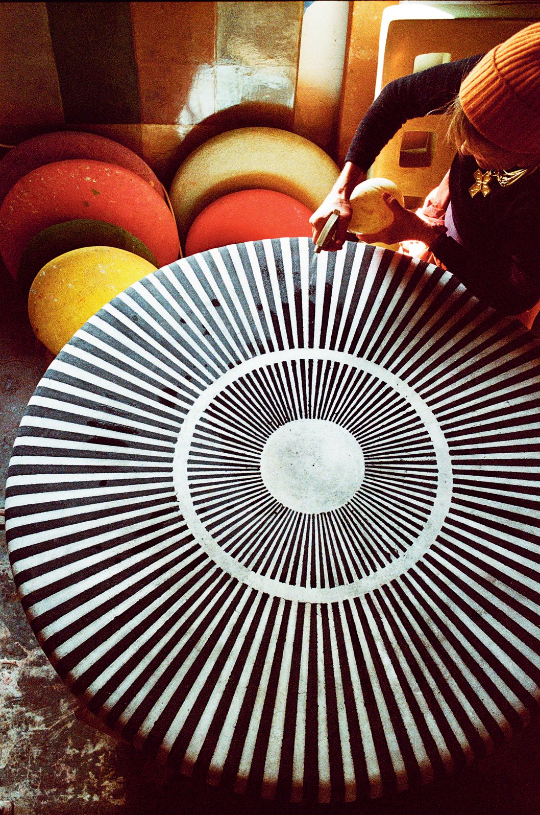
Dineen working on a black and white inlay fresco circle
It’s painstaking, but Dineen has no doubt that the results are worth it. ‘It has always been the content and the colour and what I want the end result to be that have driven me, rather than the process.’ She pauses to fiddle with a thumb ring, frowning slightly. ‘I am interested in the process, but it’s what I want to achieve with colour that’s the crucial thing.’ Her approach to colour in her work is as layered as the sculptures themselves. If it’s a commission, she’ll talk to the clients about their preferences, examine the light where the work will be displayed and conduct countless experiments, mixing nine, 10, 12 pigments together to perfect a shade. But a big part of why she loves the medium in which she works is that she can never completely control the result.‘ As the surface dries, it changes: you get all these lovely markings, and sometimes pigments separate, or cracks appear.’ Dineen has learnt, over time, that some pigments are more likely to give certain results than others, but always there’s an element of surprise. ‘It’s exciting. You have the potential to make something truly beautiful and unexpected.’
She illustrates the point by bringing me a sculpture. It’s a small lingam in a delicate pink, like faded rose petals, gently speckled with a paler shade, the surface traced here and there with craquelure. It feels like a pointed contradiction: the delicacy of the tint utterly at odds with the piece’s heft and solidity. We gaze at it in silence for a few seconds and then I ask about pigment she used.‘Rose madder genuine,’ she smiles. ‘Mixed with a few other things, of course.’
Kassia St Clair is the author of ‘The Secret Lives of Colour’ (John Murray Press)